Illustration Friday: 2 of 2: Rejection: Sticks n stones
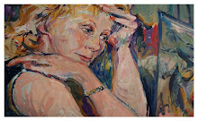
My second posting for this week...the first was the light side... Now the dark.(insert ominous music here) I thought i would give a go at depicting "how" rejection feels.... I kept the drawing rough. The head is small on purpose, because when one feels this way, they are consumed and not really "thinking". The body is strong, for 'They" are wrapped up... (so to speak) in themselves and not really looking outwards, holding themselves together, even putting aside the happy face for the moment. Let me know if I succeeded... 
and this one I was just playing around with the effects in photoshop

19 comments:
I like your concept! The technique you aplied gives a strong element to it! very nice
I like the figure's gestured pose, it has a lot of movement! Great work!
The second one is my favorite. Well done!
Lovely stuff! I like what you did with the filters-- I think it really enhances the sadness. Love the flamingos, too... and the little girl with the wild hair! Very cute!
i like the top best shows a nicer contrast between her actual pain and her happy pretend face nice emotioanl peice
wow! this is sooo emotive! i can feel her pain and rejection. very well done~
The feeling really comes accross in this. Thecolours you chose are pefect!
Beautiful artwork, and then all the misery unfolding in the tightly wrapped and injured spirit of this woman, you've captured the assault on the psyche by rejection too well. Fantastic piece!
Thank's for your comment on Mondayartday
I have visited your blog ! Nice.
BYE
Each has it's own quality and I like both. Held to a choice, I like the unmanipulated piece better - the lighter colors hold a glimmer of hope for me.
Oh yeah, we've all been there--most of us at least, and you've captured it very well. The bottom one seems to "pop" more for me, though both work very well!
The words become chains... Really like the textures in the Photoshopped version. A lot of feeling in the piece. And the flamingos below are a special treat.
Good depiction of the feeling of rejection, with the fetal pose and the symbolic mask put to the side. I too like the feel of the Flamingo piece. Thanks for your comment!
the second one has a powerful effect on me. actually, first glance, i thought she has a curly hair and has no time to even comb....
hey Janice....i love this one...beautiful...expressing so much.....:)
It really does illustrate the feeling well, very moody:)
Wow! Very powerful statement! Great job...
sisu
I like both of your takes on the word Janice. The woman evokes such a sadness and despair. I prefer the unphotoshopped version. It seems cleaner to me. And I love the flamingos and your spin on the meaning! Very clever.
Not sure how I missed this one...very painterly and nice. I like the emotion of the second one a bit better...it jumps as more dramatic with the color...but I'd take either one...
Post a Comment